Student Design Association
Project Overview
As the Graphic Design Lead for the 2022/2023 Student Design Association, I aimed to develop a design direction that reflects the year ahead for design students with a return to more in-person classes and events. Working with my creative team, we brought this vision to life, ensuring that the design was visually appealing and functional for the needs of the SDA.
Role
Graphic Design Lead
Project Date
2022 – 2023
Client
Student Design Association
Involved
Rebranding
Print and Digital Design
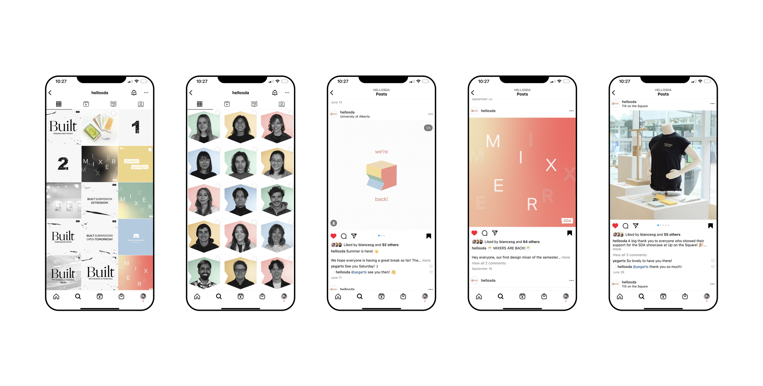
Social Media Content Creation
Copywriting
Project Details
-
The goals for this redesign included highlighting physical spaces through three-dimensional design, building off of already existing iconography, colour palettes, and design, and representing a transition back to in-person events, learning, and our growing design community.
-
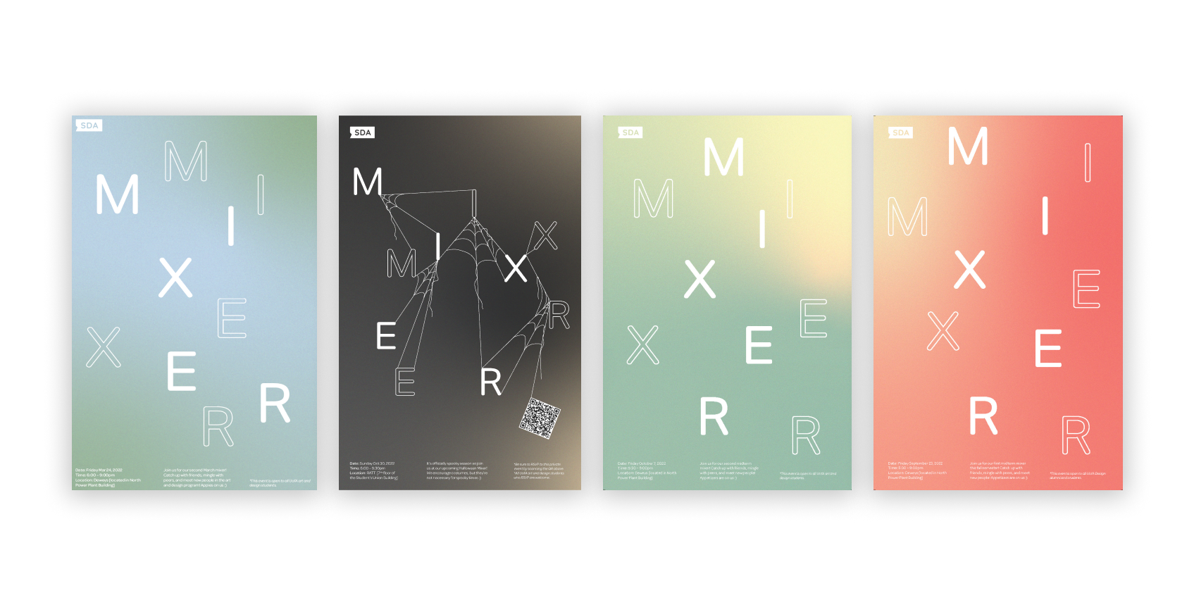
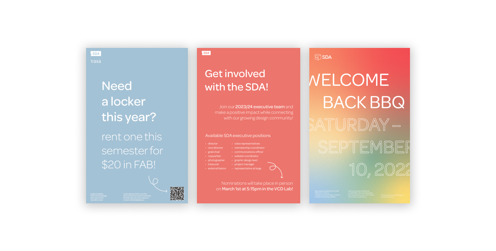
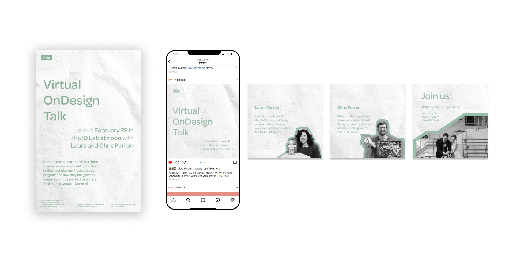
The solution involved building off of their existing system to design additional logos. Alongside an extended visual identity system, I established new brand guidelines that included bright colors, fresh elements, and exciting gradient patterns for print and digital use.
-
The target audience for this project included University students studying within the Faculty of Arts at the University of Alberta, students who volunteer with the SDA, and those who interact with the creative community within Edmonton, AB at large.
-
Interview the association members to hear their visions and identity opportunities for a redesign
Use a design audit and gather visual inspiration from previous years
Identify areas for improvement within the previous system
Design a system that can be used both in print and digitally
-
The need for this refresh arose from the transition out of the pandemic and the desire to represent the shift back to in-person learning and events for post-secondary students. As the Graphic Designer for the Student Design Association, I saw the opportunity to improve the overall impression of the association through its visuals.
The challenge for this project was to create a cohesive and effective system that resonated with the University's design community. I aimed to make intentional and purposeful design decisions that were rooted in the values and goals of our department.
-
At the beginning of the year, I had a transition meeting with the former Graphic Design Lead, Michael. He shared his insights, tips, and sage advice as I moved into the position for the 2022/2023 academic year. During the meeting, Michael and I discussed the idea of refreshing the system and how it could positively impact our student community. We both agreed that it would be beneficial to refresh our visual identity. Michael suggested that I:
"Create a brand strategy that can work to counteract the pandemic-induced break in the usual connection that the SDA has had with design students."
Design Audit
Upon securing this role, I immediately preformed a design audit to assess and analyze all the design elements used across the student design association in order to see the gaps in our branding in terms of is consistency across all channels and outlets. In doing so, I examined our social media, written documents, and what information we shared on our website. In response, I created two mood boards to reference moving forward. One mood board featured successful work from previous years, and the other featured work that actively addressed areas for opportunity within our associations visuals.
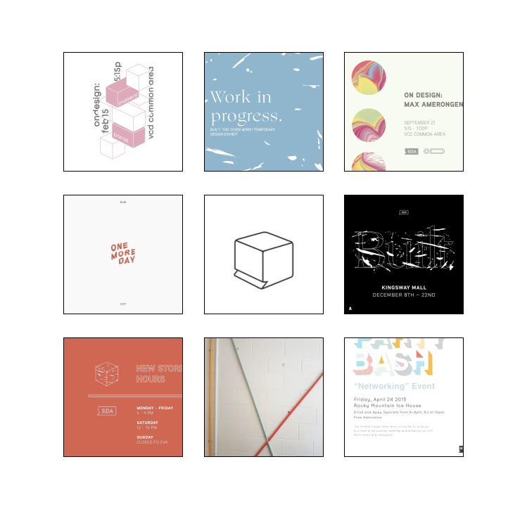
The first mood board compiles inspiration solely from within the SDA and snippets of designs created in previous years. The images include the very first three-dimensional speech bubble design from 2015, promotional work from previous Built shows, and even the colors painted on our SDA office wall. By drawing inspiration from our past designs for the new ones, we aim to create a sense of recognizability and familiarity without making drastic changes to our visual identity this year.

To further expand our existing set of visuals, this second mood board aids in highlighting a more solid direction that we want to move the SDA into. Key design elements like three-dimensional graphics, outlined text, black and white imagery, and even gradients are at the forefront of this year’s inspiration. Many of these elements were shown in the first mood board, however, by gathering additional reference images such as these, we’re able to draw stronger connections and ideas to reference later.
Logo Refinements
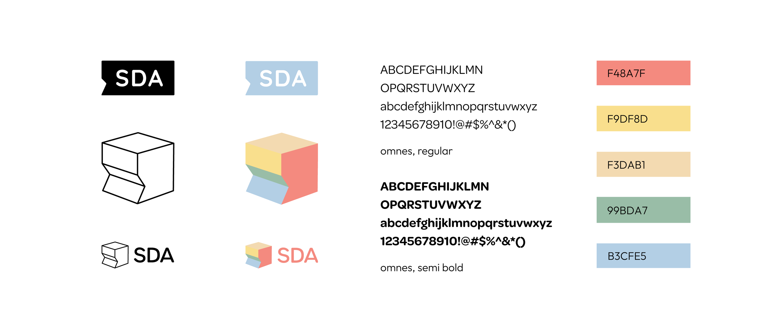
The revised logo design is a well-considered evolution of the original three-dimensional speech bubble design that retains its recognizability. The use of a cube with a speech bubble tail gives the logo a modern touch while remaining straightforward and efficient. The versatility of the design allows it to be adjusted for different applications, including the creation of alternative logos. It aligns well with the SDA's objectives of representing the shift back to in-person events and a thriving community. Overall, the new logo design aims to be a thoughtful and effective refreshment of the SDA's existing identity.

The original SDA logo largely consists of just this one graphic. For the last couple of years, it has been used by previous Graphic Design Leads and it still performs well today. This logo is recognizable and simple, however, it doesn’t fully capture the essence of the new direction we wish to move the SDA towards. Thus, this logo will be retained and used in various circumstances as it will become part of our expanding repertoire while being used less often, as we switch to a fresh primary logo.

The new logo is inspired by the first three-dimensional design from 2015. Featuring a simple cube with three sides and a cutout to form the speech bubble tail, the design still feels like the SDA, just fresher. The additional two smaller designs (shown below) show this shape can be adapted for different uses and create alternative logos that we can rely upon for this year. Bringing back this shape also means we are going back to our roots, building off of what already exists, and creating a larger SDA identity.
Developed System


Areas of Improvement
I want to thank my classmates and team members in the University of Alberta's design program and the Student Design Association for letting me be part of this project. The strong turnout for this year’s executive elections was motivating, with many candidates competing for each position. A special thank you to Director Winnie Uong and Vice Director Christine Lang for their constant support and dedication to our design community; this year's achievements wouldn't have happened without them.
If I could stay in this role another year, I would improve the visual identity of the Student Design Association and work on updating our website. Unfortunately, I couldn't meet with the web coordinator more this year due to scheduling conflicts to make changes to our association's site.